Improving the Design system.
Dizno Design System
As the product evolved and the UI underwent major changes in v2, we decided to rebuild the design system properly — this time intentionally, structurally, and based on real usage patterns. The goal was to make shadcn truly ours.
Problem Statement
While shadcn gave us a solid base, we faced several limitations:
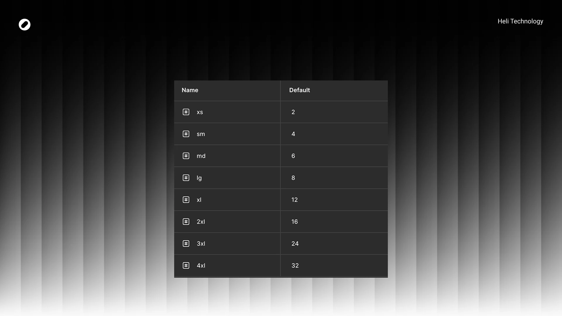
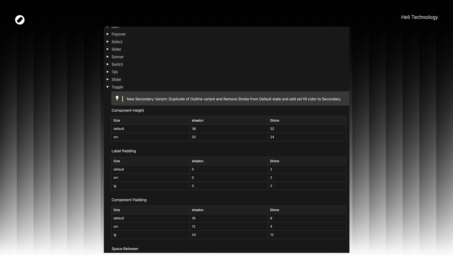
Component size restrictions (heights, paddings, spacing)
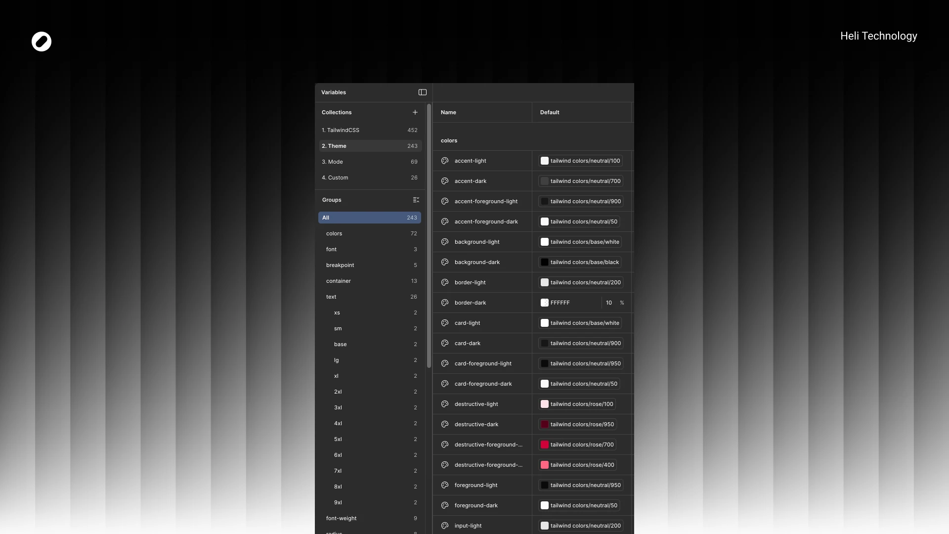
Color token mismatches with our brand
Radius inconsistencies with our visual direction
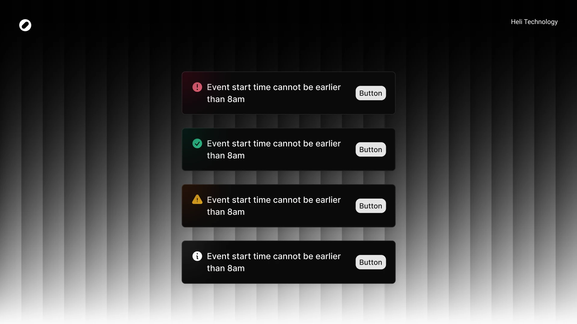
Missing semantic tokens (success, warning)
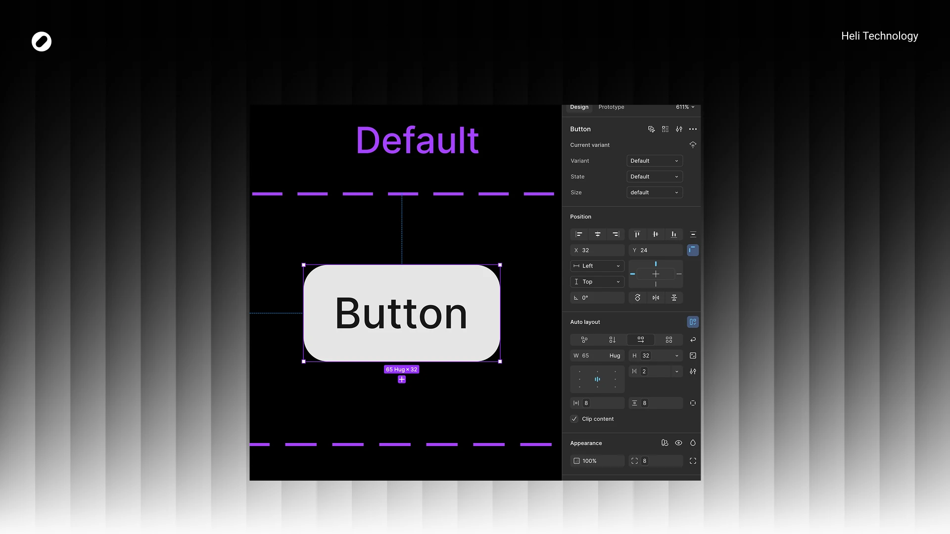
Inability to use default components across all product scenarios
Lack of clear documentation on what exactly was modified
Scaling up the product, these gaps became friction points — especially between design and development.
The engineering team needed clarity on:
What exactly changed compared to default shadcn?
Where were we diverging intentionally?
What should remain aligned to avoid technical debt?
Goals
Align the system with Dizno’s updated visual language
Enable flexible component sizing for real product needs
Reduce design–dev ambiguity
Minimize unnecessary deviation from shadcn (avoid extra engineering burden)
Document every intentional change
My Role
Defined system direction
Rebuilt foundations (tokens, typography, radius)
Audited used components
Designed and structured new variants
Documented all deviations
Led technical alignment session
Finalized design–dev sync before implementation
Color Tokens
Instead of jumping directly into components, I rebuilt the foundations:
We replaced and refined core tokens to match Dizno’s identity.
Examples:
neutral-950 → black for background-dark
Red destructive palette shifted to rose spectrum
Chart colors replaced with brand-specific values
New semantic tokens added:
warning
success
with full light/dark foreground mappings
We also introduced proper token pairing for light/dark modes to maintain consistency.
Radius System
hadcn were reduced in some areas and standardized to match Dizno’s softer visual identity.
Example:
sm: 6 → 4
md: 8 → 6
Many components unified at 8px radius
This helped create visual consistency across inputs, buttons, popovers, and tabs.
Component Strategy
After foundations were locked, I audited all components used in real designs and documented deviations from shadcn.
Key Principles:
- Keep structure intact
- Adjust sizing to match product density
- Reduce padding where needed
- Introduce variants only when product demanded it
- Avoid unnecessary engineering overhead
System Adjustments
ensity Optimization
Dizno required a more compact UI.
Examples across components:
- Default height: 36 → 32
- Small size: 32 → 24
- Internal spacing: 8 → 2
Component padding often reduced by 50%
This significantly improved information density without harming readability.
New Variants
We introduced purposeful variants:
- Toggle → New Secondary variant
- Slider → “No Tracker” variant
- Sonner → destructive / warning / success / info / loading
- Tabs → New lg size (40px height)
- Input / Select / InputGroup → sm & lg structured sizing system
These were introduced only when tied to real product use cases.
Visual Refinements
Examples:
- Tabs active fill changed to background:accent
- Switch radius standardized (container 8px, inner 6px)
- Slider stroke thickness: 1 → 4 (stronger visual feedback)
- Sonner received visual enhancement with blurred color circle per variant
All changes were documented comparatively:
shadcn vs Dizno
Documentation
All differences were documented in Notion, including:
- Token comparison tables
- Component-by-component deviation logs
- Size changes
- Padding adjustments
- Variant additions
- Visual modifications
This allowed the dev team to clearly understand:
- What changed
- Why it changed
- What remained aligned
Handoff & Alignment
We held a dedicated session with:
- Developer
- Tech Lead
In that session:
- I walked through foundations
- Explained intentional divergences
- Answered technical concerns
- Got approval before implementation
The focus was alignment — not just handoff.
Impact
- Unified visual language across v2
- Clear design–dev parity
- Reduced ambiguity in component behavior
- Scalable token structure for future expansion
- Improved density and usability
- Better dark/light consistency
- Structured documentation for onboarding
Most importantly: - We moved from “customized UI kit”
- to a product-aligned design system.