Support Chat
Our team created an innovative chatbot design that boosted lead generation by engaging potential customers with visually striking videos and images. It was a successful project due to our meticulous planning and user-friendly chatbot experience. The captivating videos and images made the process enjoyable and informative, resulting in positive feedback from the client. I take pride in delivering exceptional results with personalized services to our clients, and this project was an excellent example of our commitment to excellence.
Project Overview
The chatbot delivers built-in chat scripts for every legal matter type.
The widget is hosted on the client’s website and captures potential leads through thousands of prompts.
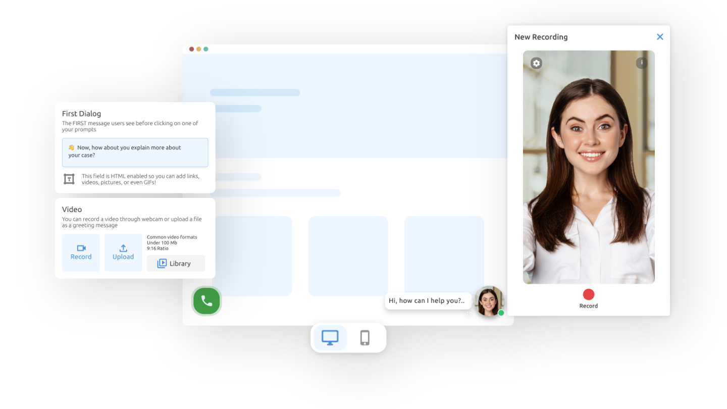
Users can ask their custom prompts & questions with a recorded video of themselves.

My Role
- Defining new potential features and redesigning existing ones on the former version of the product.
- Creating competitor analysis maps, creating user flows, and defining personas based on user research results.
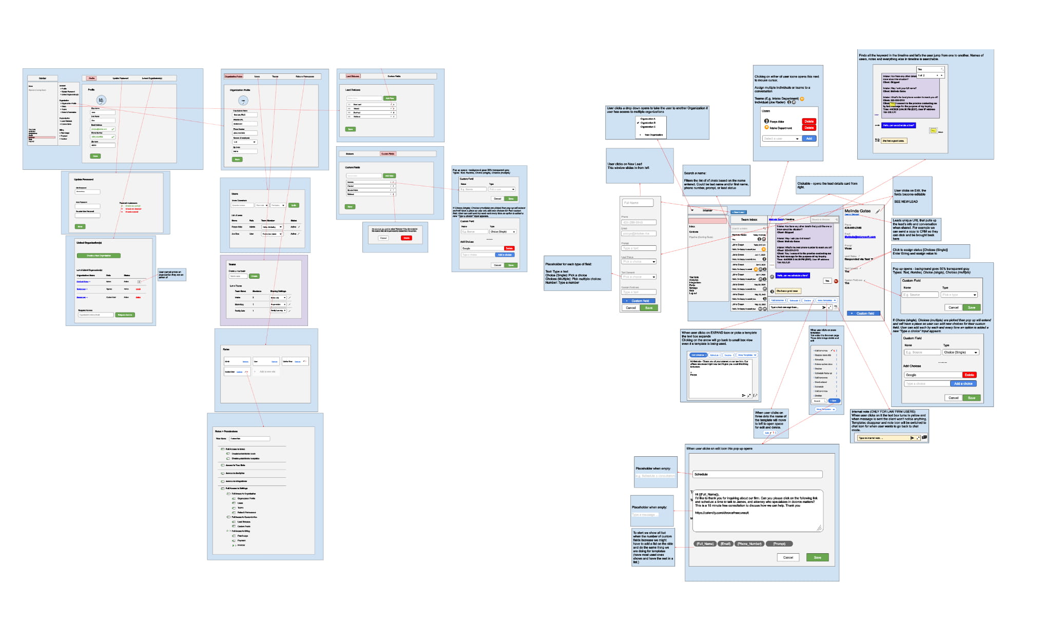
- Prototyping lo-fi and hi-fi wireframes to optimize development speed.
- Creating a design system to improve the user interface of the product.
- Documenting design stories and handing them off to development teams.
- Validating product requirements (functions and interfaces) by creating test scenarios for the QA team.
Challenges
- Creating a trustful flow for leads to sharing their contact information like Email or Phone Numbers through their specific cases.
- Defining or predicting how much detail a client’s case might have, takes time and effort.
- Users prefer to meet with the attornies in person instead of via virtual mediums.
- The widget is used by a wide range of users on various devices, and their behavior should be multiple too.
Problems
- Finding the perfect law firm that fits any case has always been challenging.
- Sometimes people find a suitable lawyer, although they are still trying to figure out how to explain their issues. Are chatbots as efficient as intake staff in guiding clients through a justified claim?
- Law firms could save time and money by managing potential leads from clients and creating a more authentic experience for clients.
Solutions
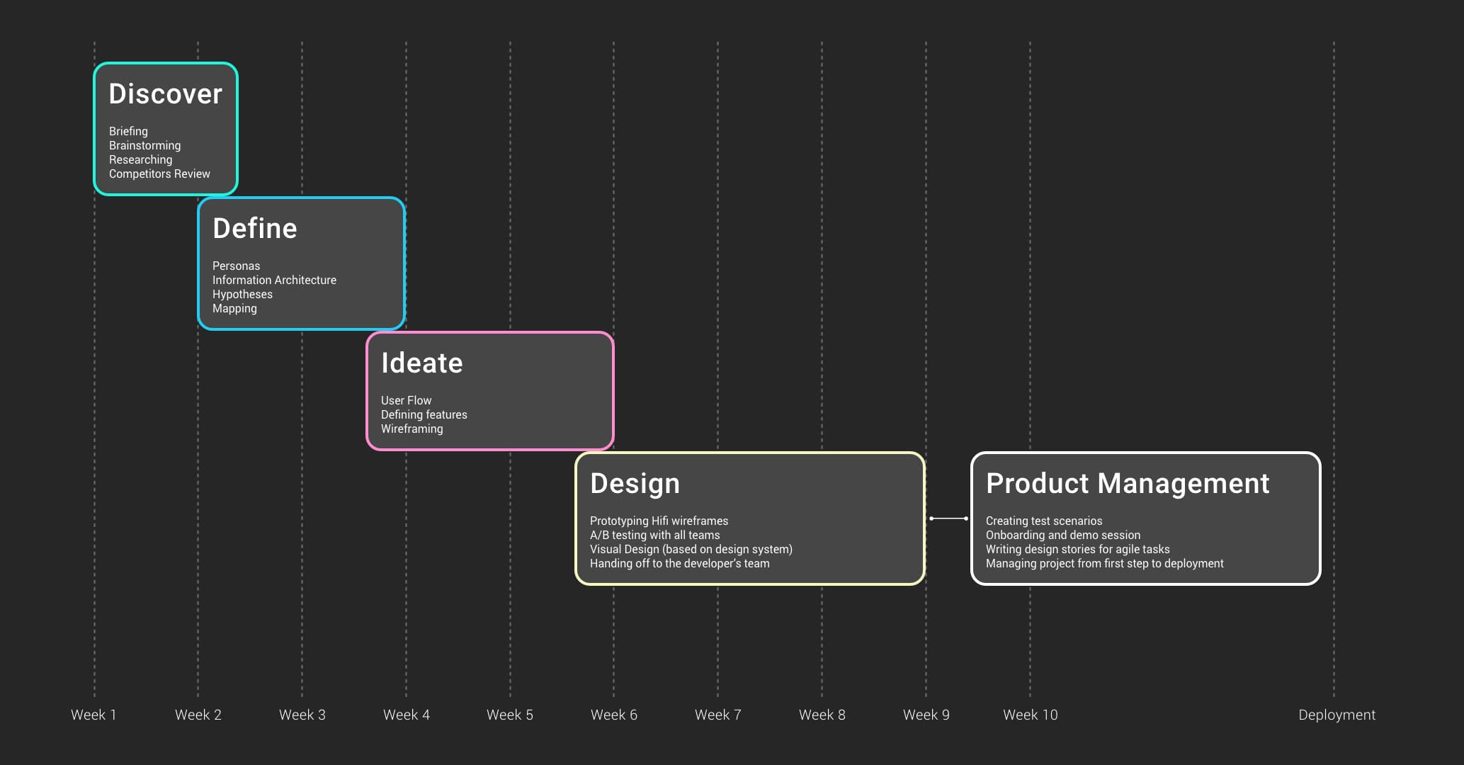
To solve problems, I used the Design Thinking approach. Here is the process I used to practice Design Thinking:
Discover-Define-Ideate-Design
Discover
Our product managers handled user onboarding sessions, but we were frequently in touch due to being capable of gaining quantitative and qualitative insights from our consumers.
Define
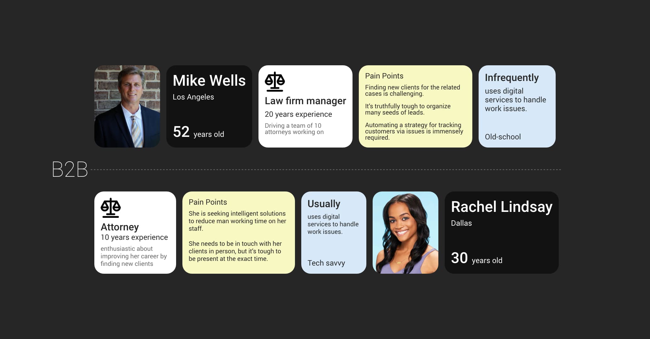
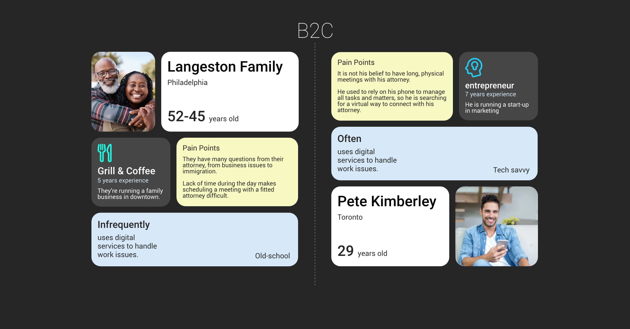
Based on the user research results and business objectives, we should cover both the Product’s B2B and B2C sides.
On the dashboard (B2B side), we were in touch with businesses growing their firm and looking for more market range.
Moreover, the Product’s Chat widget (B2C side) must be tailored to the end user’s needs.
Classic law firms:
They are unfamiliar with modern customer service tools. They rarely use software and dashboards to manage their daily operations.
Modern Users:
Using modern tools, they can manage leads and are familiar with many samples. They criticize our product to its core and compare it with our competitors.
End Users:
According to research, most people are accessing customer websites via smartphones. They may be stressed because they are in a needy situation and are searching for legal services.
Ideate
The first step was to list our existing features from the previous widget version.
We (myself in collaboration with PM and the design team) discovered several of the components that must be changed to match new requirements.
I designed a new flow for end-users in various scenarios after defining what we should keep from the previous version.
Since there were many different use cases, we found numerous elements that could improve the bot’s experience and categorized them as Must have, May have, and Nice to have.
After brainstorming user flows, I started to transform on-paper ideas into wireframes. Despite the urgent project, I should design the final prototypes ASAP; therefore, I began to create user interface components in parallax with wireframes.
Design
To understand what feeling the design wanted to convey, I designed 3 different visual versions and got them criticized by stakeholders. Then, I prototyped the approved designs to hand them off for development.
Having the approved Design System, I saved much time creating every component from scratch. As a result, the developers and I worked closely together in many sprints, mapping out the screens and details we needed to redesign.
I’ve been very open to feedback on how the design could be improved by stakeholders, Product Managers, and other team members.
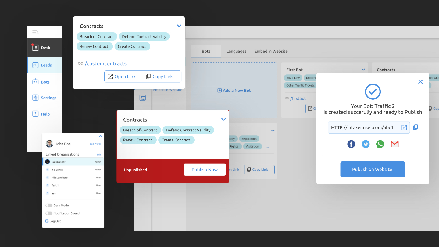
The first step was designing the flow of how users create and define a bot fast and clearly.
Dashboard
Users had been confused and overwhelmed with many unnecessary settings in the previous version and needed to catch a bot as fast as possible. With the new dashboard, they could create and organize a bot after testing how it would appear on the hosting website.
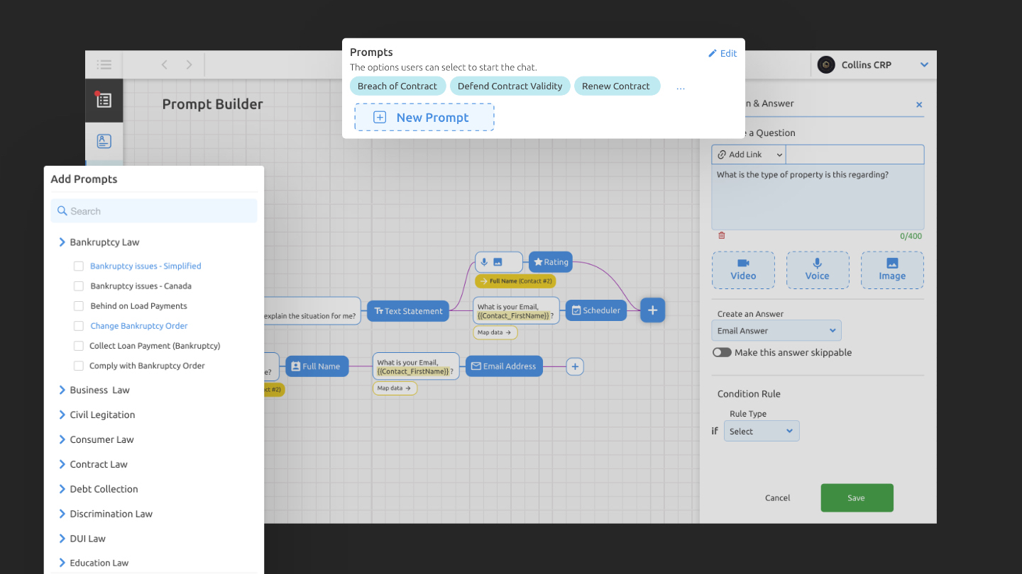
By making it easier for users to self-create the bot and prompts, many overworking tasks from the support team decreased.
Users can customize the appearance of their widgets to match their branding and the interface of their website.
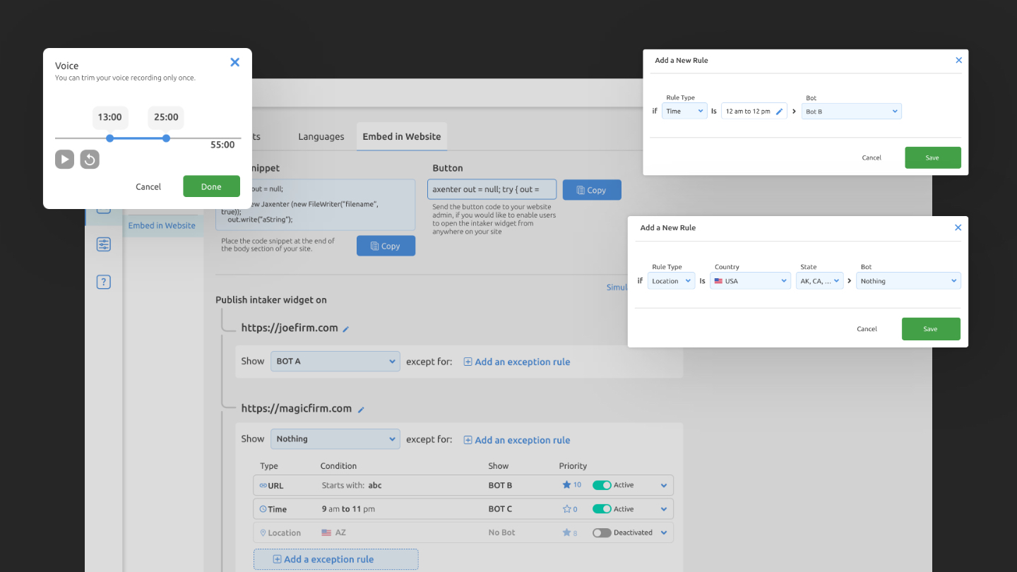
To create a bot for more accurate users, we developed a rule-based system for the entire plan. Users can create multi rules based on locations, time, links, and languages for each hosted domain by If-Then funnels.
Redesigning each dialog type to achieve better usability through a question-answer approach and accurate leads.
The user can record or upload a video of themselves in person asking a lead any question. Building video interactions was challenging due to the need for this feature in competitors’ products.
Results
Users felt that the site was cleaner and more straightforward than the competitors.
Some users needed help creating the bot, taking considerable time to find their way on the old version.
Lead generation has risen to 50%, sometimes even 80%.
By redesigning the entire dashboard, the conversion rate has risen.
Moderating more will impact how users use it to generate leads and improve their experience.
